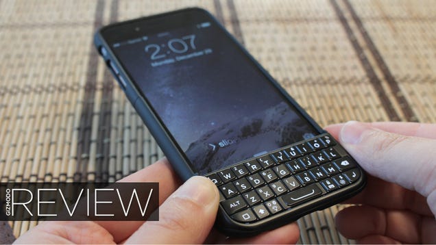
I must be a masochist. I'm typing this whole review on a Bluetooth keyboard smaller than my two thumbs. Touch-type a dozen letters or so—until I make a mistake, wind up with some gibberish and go back to hunting and pecking once more. Yep, definitely a masochist.
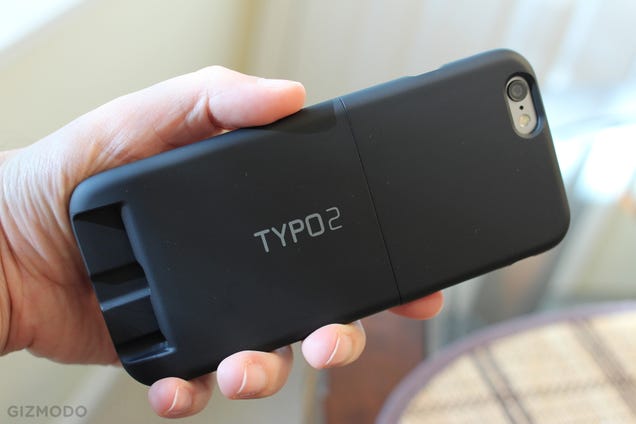
The Typo 2 is something so many poor souls think they want: a $100 iPhone case that turns your handset into a wannabe BlackBerry by adding an itty-bitty physical QWERTY keyboard to the very bottom of the phone. But the damn thing lives up to its name. I can't remember the last time I made tihs many mitsakes. I'm (trying to) fix them all as I go.
I actually like physical keyboards. A lot. I'm the guy who used to carry around a Droid 4 so that I could touch-type quotes while I interviewed people. I took all my college notes on a T-Mobile Sidekick. I told fellow gearheads that I'd switch from Android to iPhone the day I could get one with a good physical keyboard. I am the sort of cartoonish nerd stereotype that should love this thing in spite of itself.
But using the Typo—the best stab at my dreams so far!—is still more annoying than just drumming my fingers on a goddamn piece of glass.
What's so unforgivably wrong? Let's make a list! In no particular order of importance:
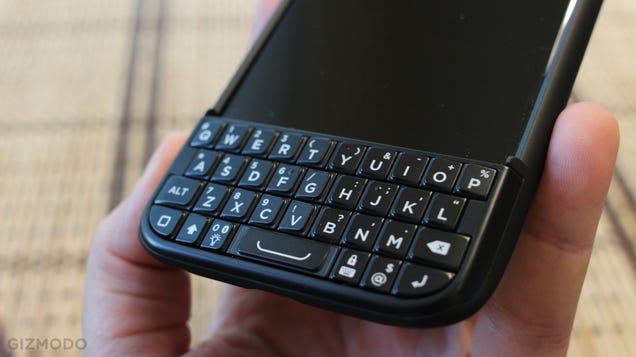
1.) The keys are small. Not unusably small, but small and closely spaced enough that they can be easy to miss. Or press two at a time accidentally.
2.) The keyboard's placed at the very bottom of the loooong iPhone 6. You're basically gripping the bottom lip of the device, which means that your thumbs are not only typing, but counterbalancing the weight of the device. Six paragraphs into this review, and my thumbs of steel (trained by decades of gaming) are already tired.
3.) There's no room on the tiny keyboard section for most of my other fingers to go. Thumbs awkwardly jab at the keys, three to four of other digits jut out into space useless.
4.) There's no auto-capitalization. You have to tap the Shift key or hold down any given letter to make it upper-case. There's also no dedicated punctuation buttons. Even periods and commas require a trip to the ALT key.
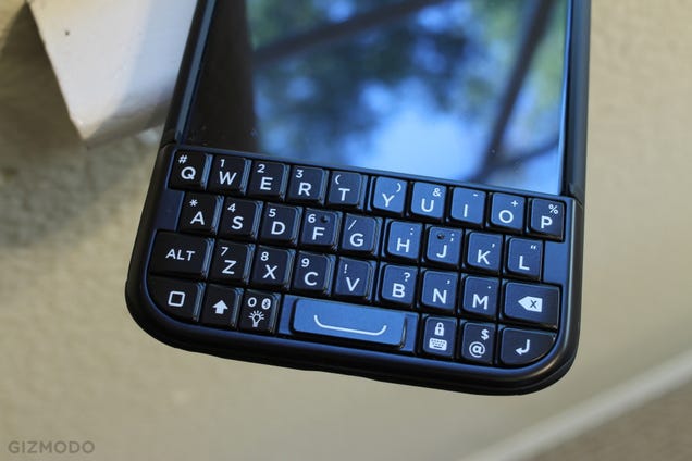
6.) Unless you're coming from BlackBerry, the Shift and ALT keys are swapped from where you're trained to expect them. Even if you are, there's a new home button in the worst possible place (between Shift and ALT), one that's freaking guaranteed to shoot you back out to the iPhone's home screen in the middle of your important email. Necessary, since the Typo blocks the real home key, but horribly placed.
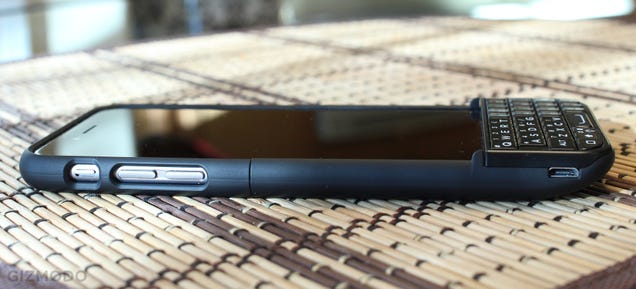
7.) Good luck tapping things at the very bottom of the iPhone's screen, because the keyboard juts out enough to make that extremely annoying.
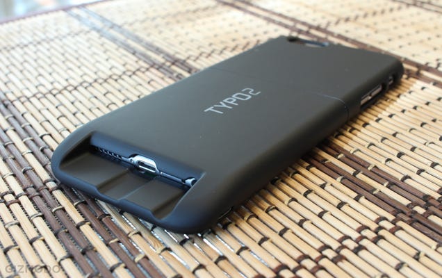
The Typo 2 isn't the worst keyboard in the world. It's certainly way better than the original. The keys feel like competent, if cheap BlackBerry knockoffs, and their ridges make them easy to find by touch. If it wasn't so uncomfortable to use, I could probably work my way up to a decent touch-typing speed after a while.
There's a backlight, which turns on and off with the press of a button. Also I've never run into any pairing issues; the Typo 2 is always ready to go as soon as I pull it out. Being able to lock the keyboard before I put it in my pocket is also a critical feature that was missing with the original.
And one of the biggest issues with the original Typo—a total lack of any autocorrect or predictive typing—is partially fixed with a button that pops up Apple's software keyboard. It blocks a lot of the screen, but at least you can summon and dismiss it as quickly as you need. It also doubles as an "irony" button.

But if you buy a Typo 2, this is what I expect will happen. At one point, after your fourteenth mistake in an important business email, you'll see that little button that pulls up the software keyboard. You'll press it, thinking that autocorrect might be nice for a change. And then, you'll realize that if that software keyboard is covering half the screen, you might as well just try it. You'll rip off the Typo case. You'll remember how much thinner and lighter and better your iPhone felt without it. You'll start typing. You'll type faster and more accurately on the lifeless glass screen than you did with all those tiny little keys.
That last paragraph? I typed it with the iPhone 6 virtual keyboard. It's one of the longest paragraphs in this post but it took the least time by far. I only made five typos, and software fixed four of them automatically. I wish I could say the same for the rest of this review. Here's an unedited example of my typical results:
Heres ab example of some typig on the FUCK why am I nack obn the homescreen? Typo's physical keyboard. Its bot ridiculously retTrible but gos I wish Iddnty have to go back and fixz all these nisyakes.
But what I wouldn't give for the iPhone's software smarts combined with my old Droid 4's physical keyboard. I actually pulled the aging Motorola phone out of its box the other day, gave those keys a spin. The old gal's still got it. Can't say the same for Typo.
from Gizmodo http://gizmodo.com/typo-2-review-thsi-is-smoe-bulsiht-1676234765
No comments:
Post a Comment